Logo Usage
Minimum spacing around all sides of the UT Health Sciences logos should be equal to half the height of the UT icon.
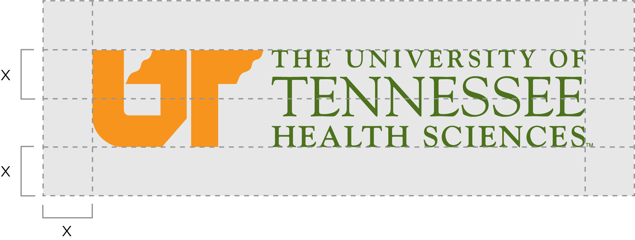
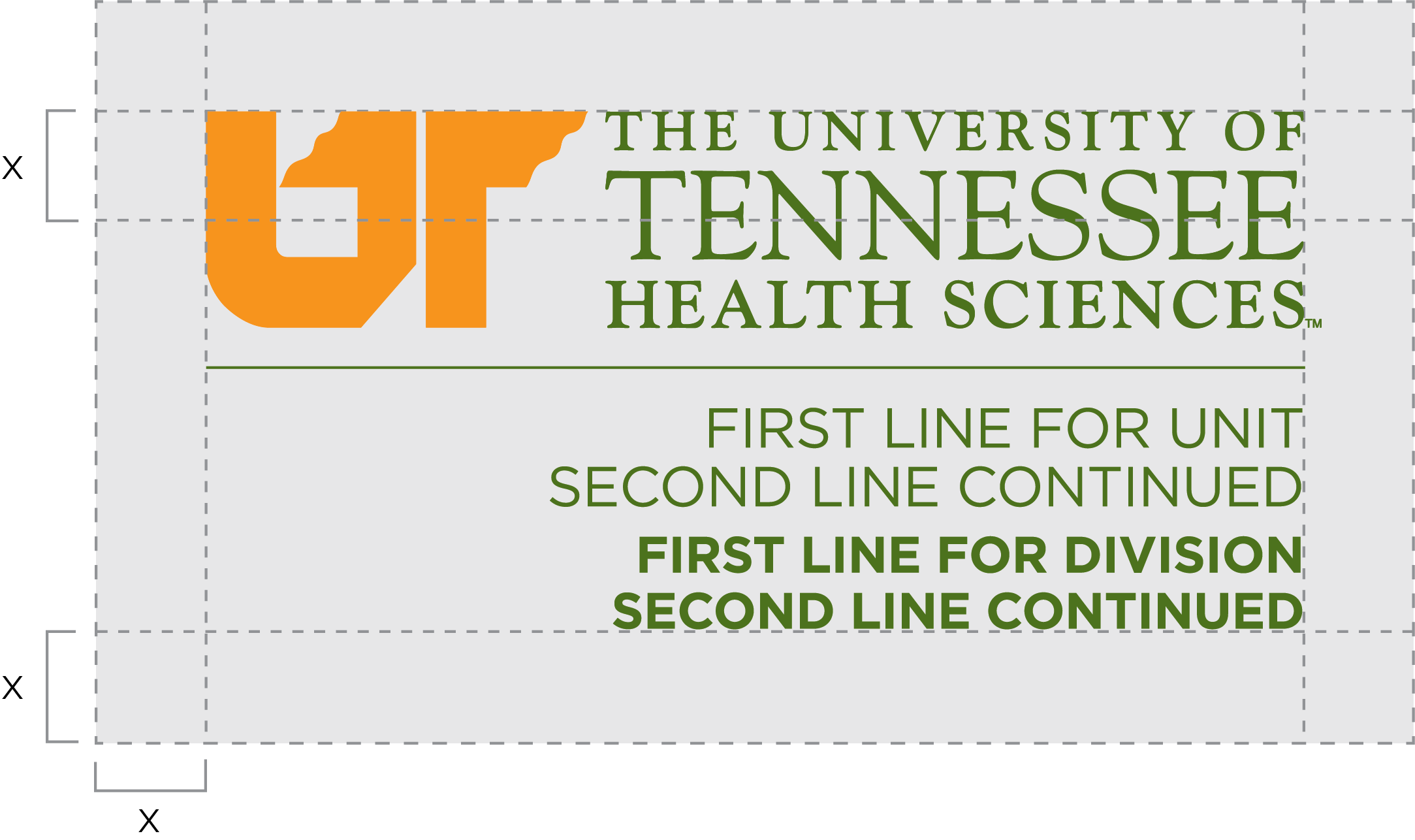
For legibility, the total width of the UT Health Sciences primary logos should be at least:
-
- 2” wide for the UT Health Sciences horizontal logo
- 3” wide for the UT Health Sciences horizontal logo + unit name
- 1.25” wide for the UT Health Sciences centered logo
- 1.25” wide for the UT Health Sciences centered logo + unit name
- 1.75” wide for the UT Health Sciences stacked logo
- 2” wide for the UT Health Sciences stacked logo + unit name

This is the correct use of the UT Health Sciences logo.

Do not alter the color of the logo.

Do not stretch the logo.

Do not rotate the logo.

Do not use a logo that does not provide enough contrast against the background.

Do not use a logo that clashes against the background.

Do not separate parts of the logo.

Do not alter unit names.
Which logo format should I use?
UT Health Sciences logos that are downloaded from the website are available in three formats: EPS, JPG, and PNG. The application being used determines the appropriate file format:
| Application | EPS | JPG | PNG |
| Banners | X | ||
| Embroidery | X | ||
| Emails | X | X (preferred) | |
| Excel Documents | X | X | |
| PowerPoint Documents | X | X | |
| Promotional Products | X | ||
| Signs | X | ||
| T-Shirt Silkscreening | X | ||
| Video | X (preferred) | X | |
| Website | X | X (preferred) | |
| Word Documents | X | X (preferred) |
- EPS and PNG formats allow a transparent background, where a JPG will have a white background behind the logo.
- EPS is a vector image, or line art, which means the logo will maintain its integrity when scaled up or down, regardless of size.
- JPG and PNG are raster images, meaning the logo is composed of tiny dots that will separate and appear fuzzy when scaled up in size.
- PNG formats are the most appropriate for web/email use.
